How to Try Out the New Windows 10 System Icons
Windows 10 will soon receive a host of new system icons that will give a much needed update to the look and feel of the operating system (to Windows 10X). The icons appear slowly in test builds of Windows 10, and you can test them ahead of time if you’re a Windows Insider . If you don’t want to deal with beta releases, the best thing you can do is stare at the entire suite of new designs from afar – until they finally make it to Windows 10, which should happen soon.
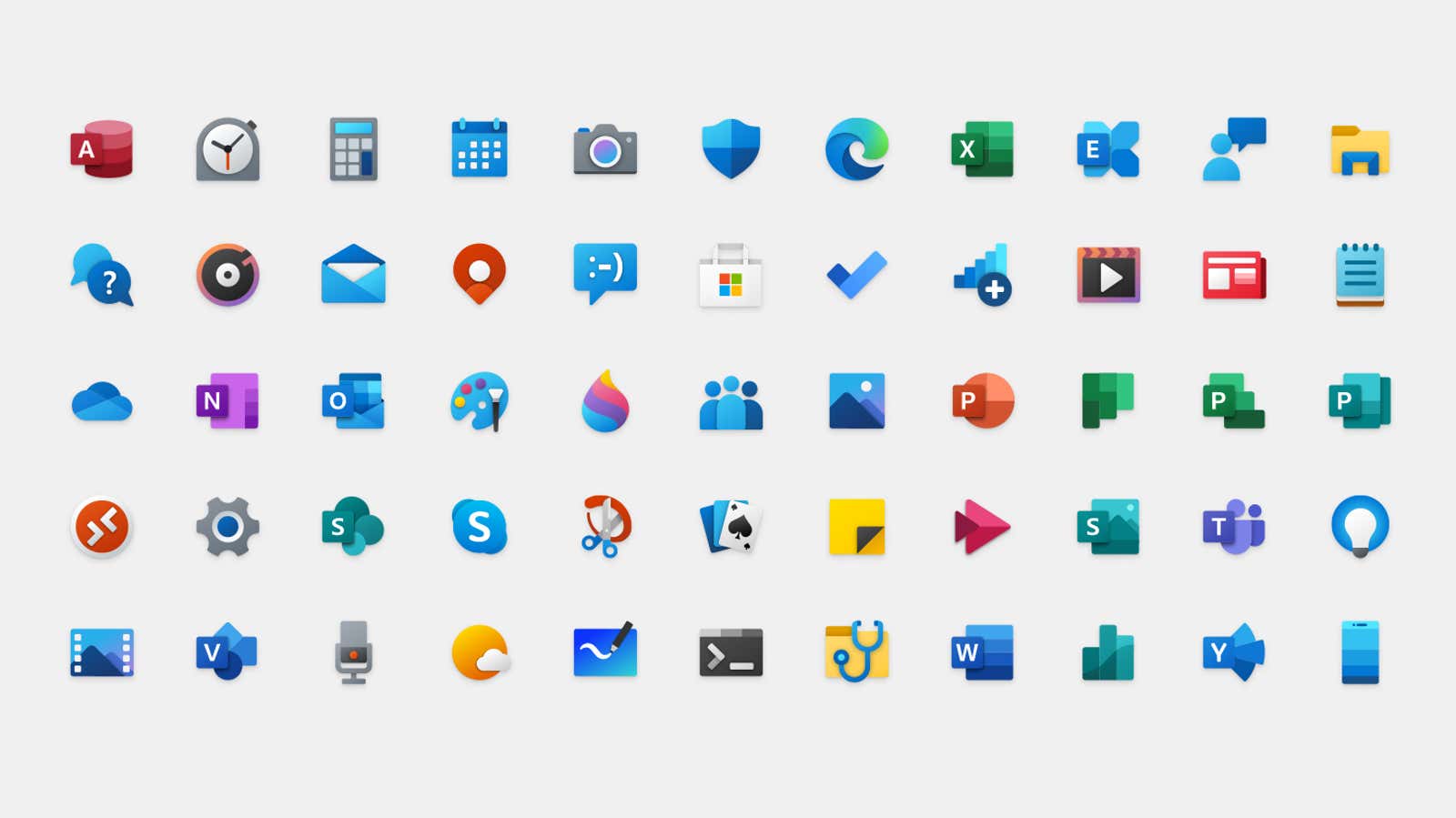
I think the new design looks great; The monochrome silhouettes of 2015 are replaced by colorful and expressive shapes. Unfortunately, not everyone likes the updated look. But the problem is not with the new icons, but with the monochrome background of your Start menu.
The background color of your Start menu is usually set to the accent color of your Windows theme, and it changes dynamically whenever you tweak a setting or refresh your desktop image. These new icons use the same blue background regardless of your settings (because of course updating Windows will make things worse somehow ).
Idiosyncrasy like this is common in Windows Insider builds, and I suspect they’ll be fixed by the time the new icons are published. (Microsoft plans to include them in a big Windows 10X update later this year.)
If you receive updated icons and they make Windows look so bad that you are ready to ditch your current desktop theme, try changing the background image and / or adjusting the accent color of your Windows theme by right-clicking the desktop and choosing Personalization> Colors … This should help the new icons blend in better – either by bringing the unchanging blue as close as possible, or helping you find a decent complementary color .