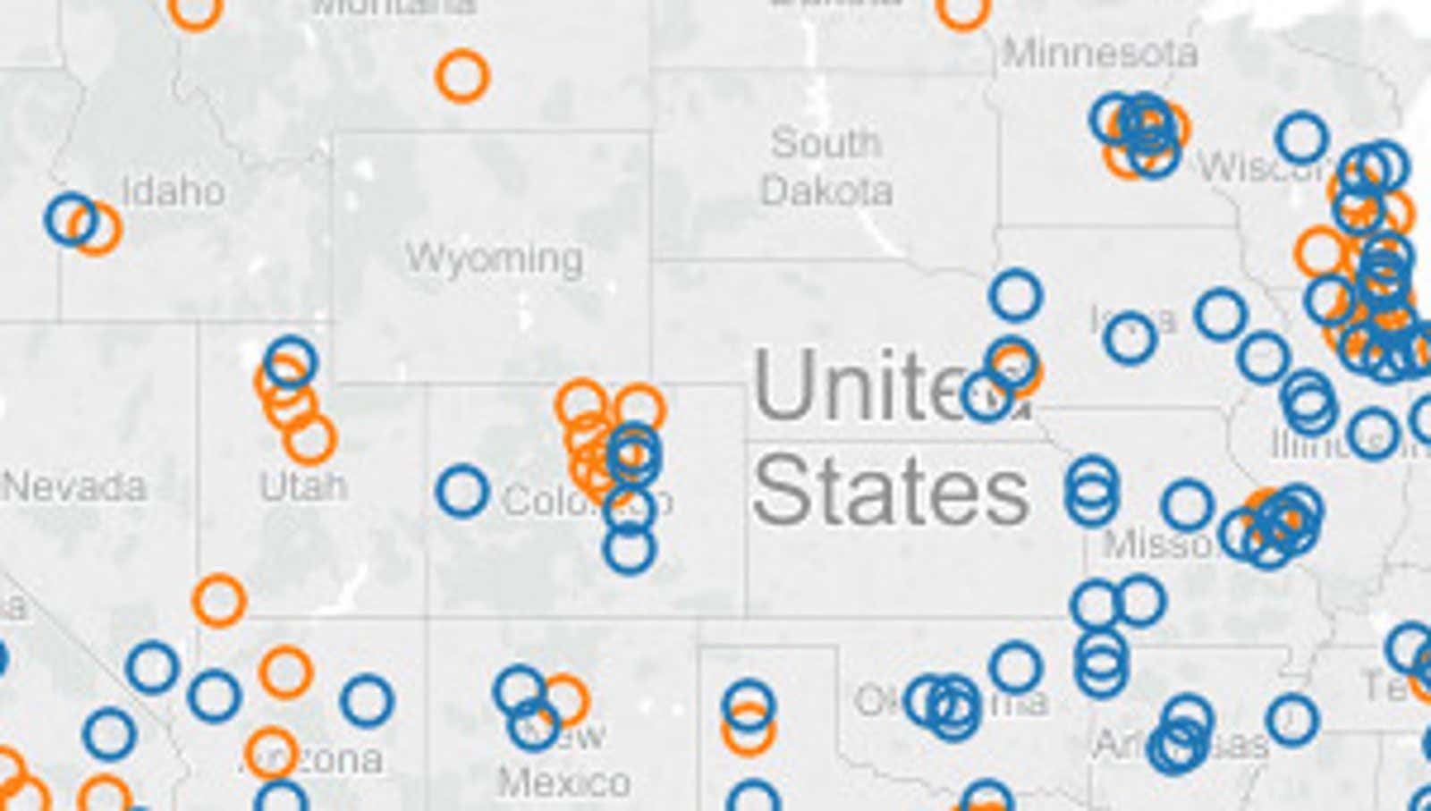
This Interactive Map Shows If Renting or Buying a Home Is More Affordable by County
Deciding whether to rent or buy a home is n’t just numbers . However, money is a very big part of the equation, as are location and purchase and rental prices in your area. RealtyTrac’s interactive map provides a clear indication of the affordability of these housing options.
This data is based on rent data from the US Department of Housing and Urban Development, wages data from the Bureau of Labor Statistics, and home sales data from RealtyTrac in 504 counties with a population of 100,000 or more.
To determine if buying or renting is more affordable, the analysis compares what percentage of a person’s average income will go to rent with what percentage will go to home ownership. Income data is based on average monthly wages for the area, and rent data is based on 50th percentile average rent data for 3-bedroom properties. The home purchase affordability analysis takes into account a 3% down payment, real estate tax, homeowner insurance, and private mortgage insurance in addition to the average monthly mortgage payment. (Unfortunately, this does not include home maintenance and other hidden homeownership costs .)
Again, this is not a trivial situation and we highly recommend using the New York Times Rent or Buy Calculator to calculate your own numbers. But you can hover your mouse over your county in the map below to get an overall picture of the purchase and rental costs for your area.
Rental affordability analysis for 2016 found buying more affordable than renting in 58% of US markets | RealtyTrac