How to Use Basic Design Principles to Decorate Your Home
Some people are born with a great flair for decoration or design. Others learn this skill and can apply it successfully. And then there are the rest of us. If you don’t have special design talent, a few basic tricks can go a long way.
These rules and principles of decoration are quite simple, and anyone can apply them. Your home may not look like a West Elm catalog, but it will look presentable.
Follow the rule of odd numbers
You may already be familiar with the rule of thirds for photography. Design with odd numbers as a base can create harmony and visual interest, explains designer Cecilia Walker :
The basic idea behind the rule is that parts and objects that are arranged or grouped into odd numbers are more attractive, memorable, and effective than pairs with even numbers.
It helps to group objects of different heights, shapes, and textures. At the same time, they should have something similar. This advice seems counter-intuitive, but the bottom line is that there must be something that unites your subjects, but also something in each of them that is slightly different.
Take a look at the image above for an example. Three vases, all of different heights. The main materials are the same – wicker and glass. But there are subtle differences in the elements – sand, water and lime texture.
Walker notes that this is just a basic rule and may not work in all cases. But if this grouping does not suit you, act intuitively. The goal here is to make sure that things are not uniform and, as a result, boring.
Find the focal point of your room
The focus of a room is its most important feature. It is something that naturally attracts your eyes when you walk into a room. And everything around the focus complements it.
If you’re unsure of how to start decorating a room, finding its focal point is a good place to start. Many rooms have built-in focal points, such as a large window with a beautiful view or a fireplace. If your room doesn’t have a built-in focus point, here are some tips and options for creating one:
- “Paint one wall a different color and then decorate it with art or shelves,” says interior designer Coral Nafi .
- “Decide what you want to use the room for, and then create focus around it,” says The Inspired Room . For example, if you want to use a reading room, you should focus on the bookshelf.
- Nafie also suggests simply using a large piece of furniture as a focal point.
- You can use a large piece of art as a focal point. A large mirror will also work well.
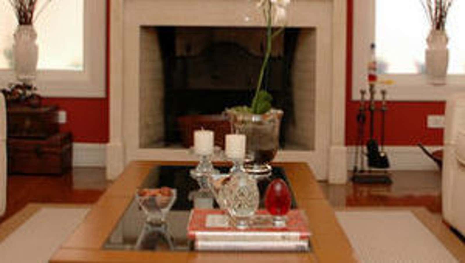
Once you find the focal point, decorate it. Use its primary color in elements throughout the rest of the room. In the example above, the focus is the fireplace – white. Red walls accentuate its color, while white candles, orchids, and vases throughout the room complement the fireplace.
You can also frame it. In the photo, vases, windows and sofas are used for this. The fireplace is easy to arrange, as it usually comes with a cape. You can add decor to or on top of the robe. If your focal point is a large window with a great view, you can arrange the furniture so that it frames it. If it’s a large mirror or an interesting piece of art, you can frame it with two smaller pieces on each side, for example:
Once you have a focal point, it helps balance the room. Apartment therapy explains:
The center point is the core of your room’s layout. It doesn’t have to be exactly in the middle of the room, although it does in many homes. The focal point of the living room is where the coffee table or center table will sit, with seating areas around it.
Think of it as the anchor of the room.
Know the basic rules of measurement
When it comes to hanging curtains or arranging furniture, most of us just look at it on the go. But there are certain sizes for decoration that enhance the look of the room. Here are some general criteria to keep in mind:
- Distance from coffee table : Keep at least 15 inches between coffee tables and sofas, says decorator Maria Killam . Apartment Therapy suggests leaving about 18 inches between them.
- Hanging art: When hanging art, keep the center of art at eye level, which is usually 56 to 60 inches off the floor, says Driven By Decor . If you are hanging multiple pieces of art, keep the center of the entire composition at this level.
- When hanging artwork over your sofa, make sure it doesn’t exceed 2/3 the sofa’s width. You’ll also want to leave 5-9 inches between art and furniture, adds Driven By Decor.
- Hanging Curtains : Crate and Barrel say it is typical to have a 1-3 inch overlap on either side of the window. For height, they say you should install eaves 4 inches from the top of the window. But perhaps you want your windows to look wider or taller. Real Simple says you can go beyond the 4 “standard to create the illusion of height, but don’t go over 8” or it will look awkward. To create the illusion of width, feel free to violate the 1-3 inch standard. You might want to increase the width to 12 inches on each side.
- TV Distance : How far your TV should be from the sofa will depend on the size of the sofa. We’ve talked about viewing distance before . The simplest rule of thumb: multiply the diagonal of your TV by two. This is roughly how many inches your TV should be away from your seating position.
There are three basic rules for carpets that you can follow.
Everything is included : if the rug is large enough, you can put all the furniture legs on it. But you should leave 12-18 inches of the floor on all four sides of the carpet, – advises site decoration Houzz.
Turn everything off : If you have less space, you can choose a smaller rug and leave all four feet of your furniture on it. Houzz adds: “Don’t go too small, though, or it might seem insignificant, like an afterthought.”
Front : Many designers prefer to simply place two of their front feet on the carpet. It can tie everything together and create a sense of openness.
Again, most of these sources contain one big caveat: don’t be afraid to break these rules. They don’t always work, but they are good guidelines to follow.
Consider your negative space
Sometimes less is better. In design, negative space is an area that is not occupied by any subject. Most often, this is a white area on the walls. It’s tempting to fill every space with an item, but sometimes negative space speaks for itself. Apartment therapy explains :
In writing, sentences often contain unnecessary words, without which the sentence would sound normal. Train yourself to look for these moments in your own home. Is there a narrow wall with a small smudge of art that, if pulled down, would still look like a beautiful wall? Is there a countertop with a youthful vignette that would look just as impressive if removed?
Decorating negative space can be a little tricky, but there are several ways to do it:
- Avoid clutter . This is probably the best and most common way to make the most of negative space. A bunch of things might fit perfectly on your desk, but that doesn’t mean everything should be there. Leave some space – some negative space.
- Be intentional. Make sure the negative space serves a specific purpose. You can leave the area blank to highlight a nearby decorated area. Or maybe negative space creates an interesting design.
- Look at the shapes . SF Gate Home Guides explains that two contrasting shapes can create strange or interesting negative space. “A curved coffee table can soften the harsh negative lines of space created by corner sofas and chairs in a square room. But this floor plan may not work in small spaces, making the edge of the round table too close to the sofa for comfortable seating.”
To clarify, it’s not just about finding places to put things away. It’s about finding places that look great even when they’re empty. This also applies to considering the function of empty spaces between objects.
Fold your lighting
Lighting might be a standalone post, but here’s what you should consider when you don’t know much about it. First, learn the three main types of lighting:
- Ambient: Also called general lighting, it is overhead lighting designed to illuminate a room evenly.
- Challenge: As the name suggests, task highlighting is designed to illuminate a specific task. A lamp in the living room can illuminate the reading area. The lamps under the cupboards in the kitchen serve as work lamps for the countertops.
- Accent: Accent lights are designed to highlight a specific subject. You can see them, for example, in paintings.
Adding different types of lighting can give your room a dimension. Start with ambient lighting in each room, then think about how you can use work and accent lighting. Real Simple has some specific tips on how to do this in every room.
Aside from these basics, you will probably also want to make your home look like your own. We also have some tips on how to do this . These guidelines will help you get started, but you should tweak the layout to suit your tastes and preferences. Use these rules to get started, but don’t be afraid to break them and follow your instincts if something seems right to you.