Find Out Where Your 2016 Tax Dollars Might Go With This Interactive Tool

We all have different opinions about how our tax dollars are spent, and in forming those opinions, it helps us know exactly where they are being spent. This interactive tool from the White House makes it easy to see where your 2016 tax dollars are supposed to go.
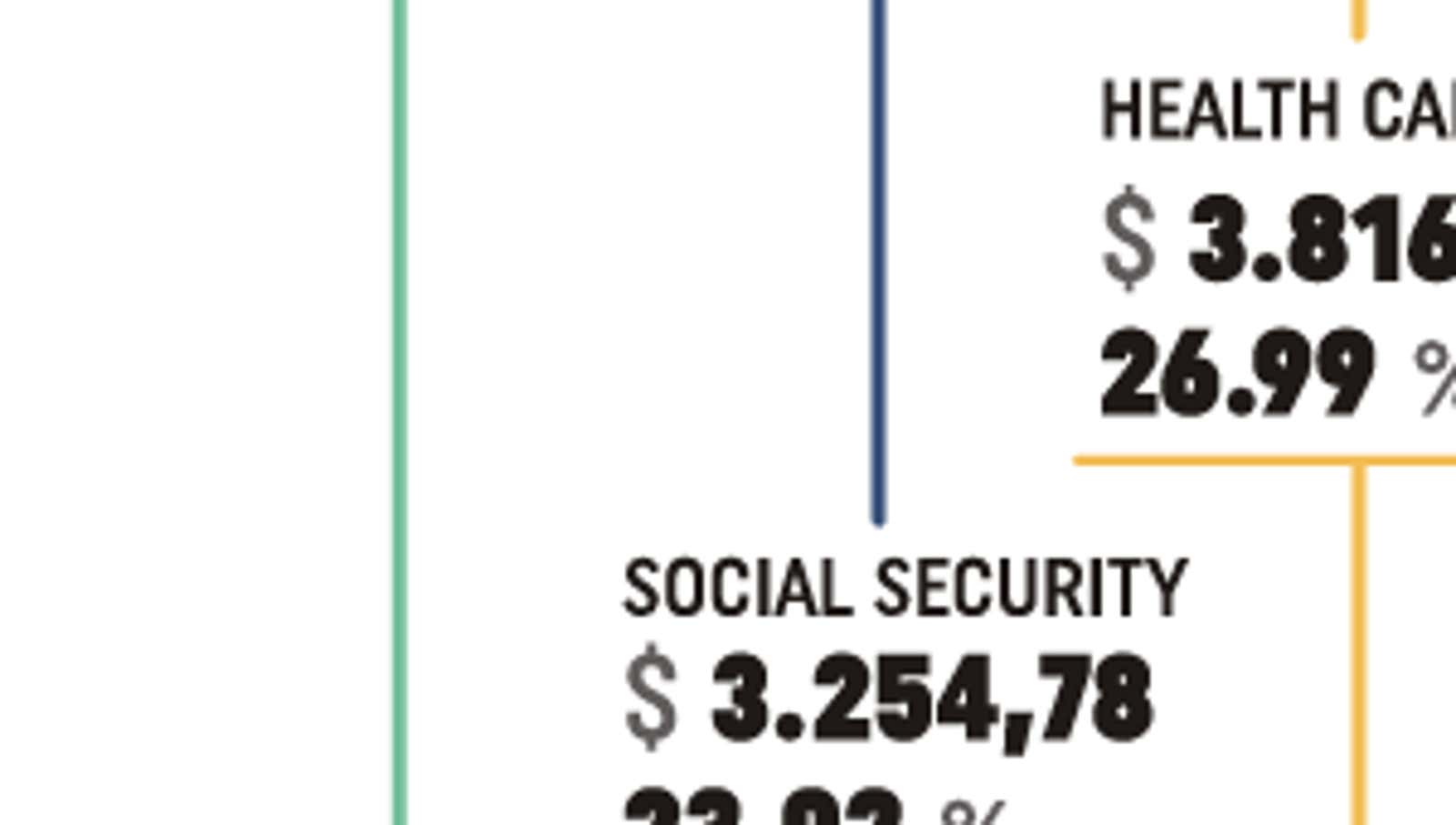
The tool illustrates a breakdown of the federal budget based on President Obama’s 2016 spending plan. Just hover your mouse over a category to see the proposed spending in millions of dollars. You can also click on each category for a short explanation.
As you can see, health care, welfare, and national defense will account for the majority of our tax dollars. Although the graph shows a breakdown for 2016, the information usually does not change much from year to year. Nonetheless, it’s an interesting and useful look at how our tax dollars are spent.
Check it out at the link below.
Budget 2016 Interactive | WhiteHouse.gov
Bugfix : We originally put this infographic in a post, but you all pointed out some issues with it, so we’ve modified this post to use it in a much more accurate (and interesting) interactive tool from the White House.